Hi everyone
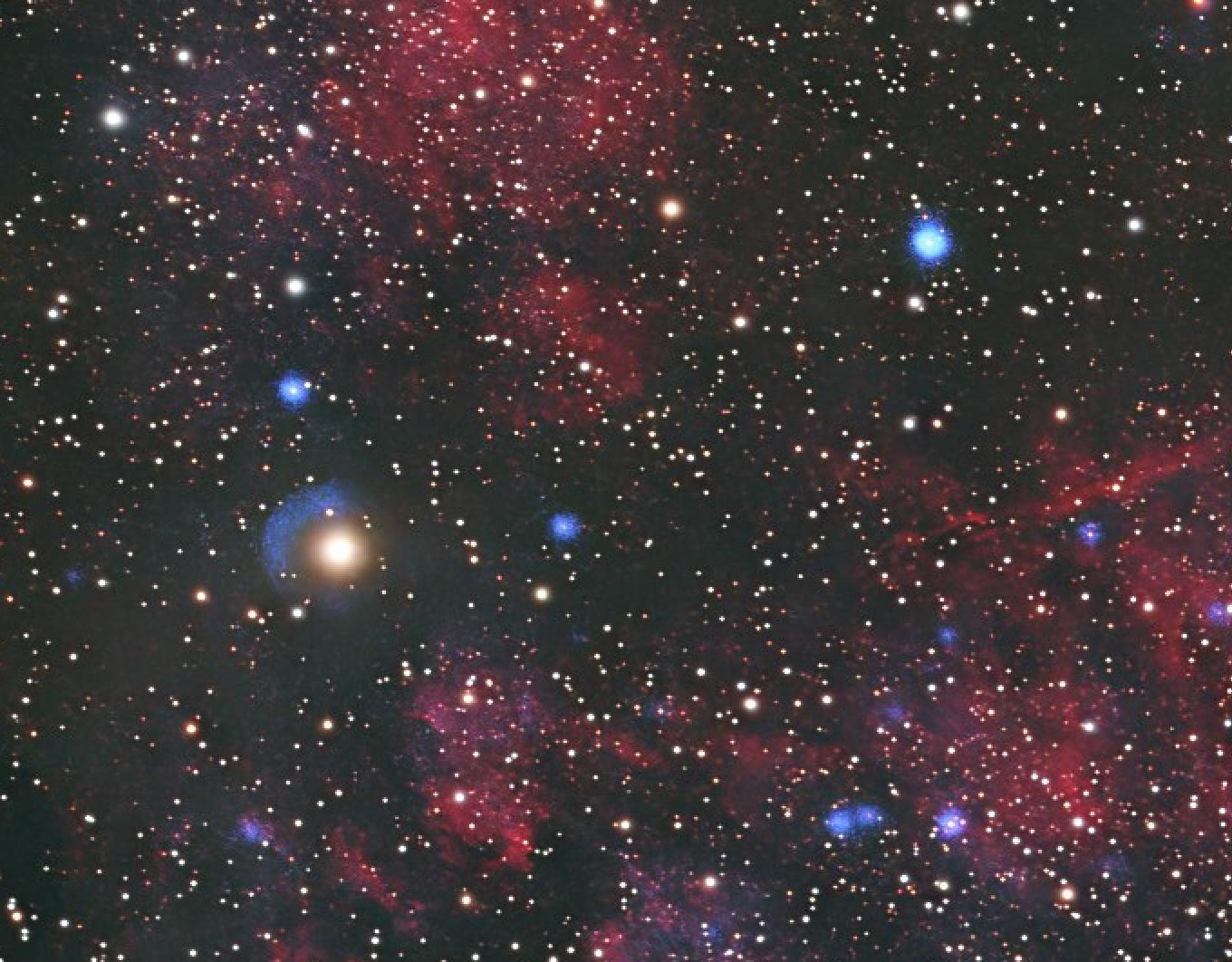
Upon seeing your image, the first thing I notice is that it is generally oversaturated. This eliminates the sense of depth, as the contrast within the gas structures is lost.
I would recommend keeping levels moderate, since not all monitors are calibrated the same way—though that "elephant in the room" is a topic for another day.
It looks like the image was heavily stretched and then had extra contrast applied.
Remember the general rule: less is more.
The same applies to the stars, which further contributes to the image's flat look.
I won't go into detail about colors; our hobby has evolved to include a vast array of hues and tones, some of them very creative.
Here are my recommendations—the ABCs of astrophotography:
Start with galaxy images (especially medium-sized ones) using only RGB. This helps you process a basic image and allows you to learn to crawl before you walk.
It helps you manage the background and control star brightness—since the background is generally dark—among other things I won't elaborate on here.
The next step is LRGB. By including Luminance (or Super-Luminance), you can learn about composition and its effects on an image that doesn't have a lot of color (like galaxies with large dark backgrounds), as well as controlling brightness, HDR, and more.
From there, I would move on to LRGB+Ha for large galaxies (those occupying 50% or more of the frame). Let's just say it opens up a whole new world.
After that, it’s a matter of personal preference; I would move on to LRGB imaging of nebulae—specifically LDN targets. It’s the perfect bridge between galaxies and nebulae in the learning process.
Good luck, and I hope to see more of your images soon.
Always remember what Picasso said:
"The chief enemy of creativity is good taste."
Keep looking at the stars.
CS
Brian